Abstract
This project was a given assignment during Ironhack's UX/UI bootcamp. It had to be completed in 4 days in solo. The challenge was about conducting a heuristic evaluation of an app of our choice and redesign what has been identified as heuristic problems. The result had to be an interactive and responsive prototype of a mobile app.
This project was involving only UI design skills.
Following are the complete set of tools, processes and methods used during the project as well as some illustrations of deliverables.
The detailed story is available on Medium as a case study article. The link is available below if you want to find more about this project.
Tools, methods and processes
Design thinking - Visual competitive analysis - Heuristic evaluation - Brand values - Moodboard - Style tiles - Style guide - Hi-fi wireframe - Interactive prototype - Usability test - Desirability test - Video capture tool - GIF maker tool - Design critique

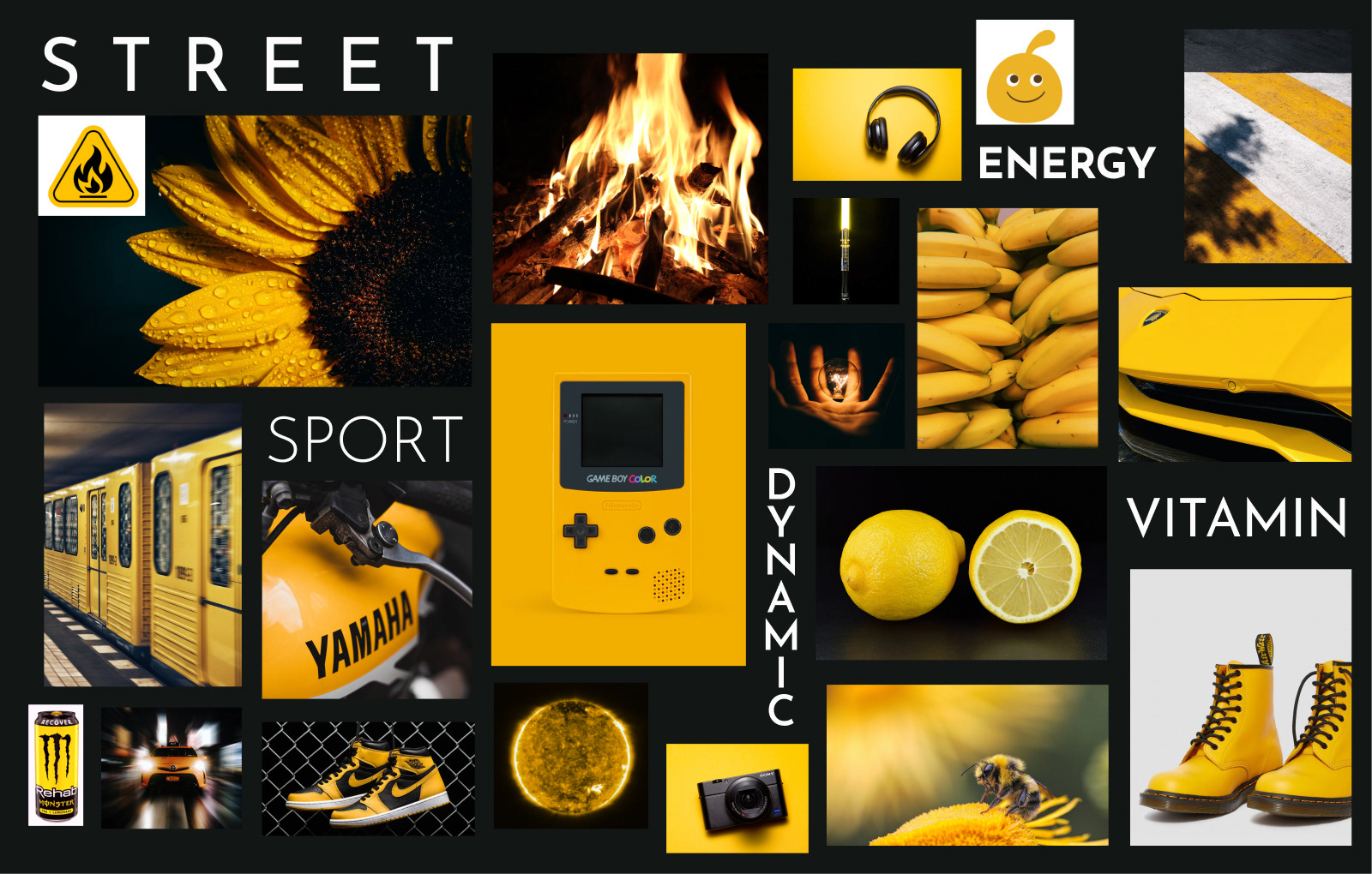
Here below the mood board I used to redesign the color palette. Based on my research, I found out that streaming platforms use red (e.g. Netflix), blue (e.g. Prime Video or Disney+) and green (e.g. Hulu) as primary colors and decided to use yellow to create a more intended disruption than orange (the actual primary color of Crunchyroll). I removed the blue (complementary color of orange) to give more consistence to the design and more contrast with the content which is very diverse and colorful by nature. Lastly, yellow is a color often used in anime as the hair color or power color of the main character (e.g. Son Goku in super sayan mode).
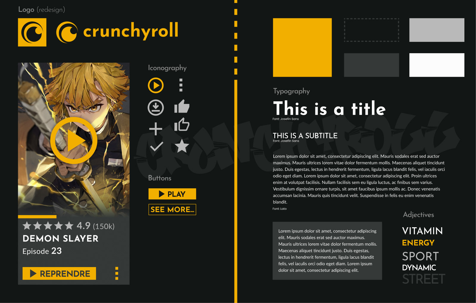
The Style Tiles I built from my Moodboard to symbolize dynamics, energy, and modernity.
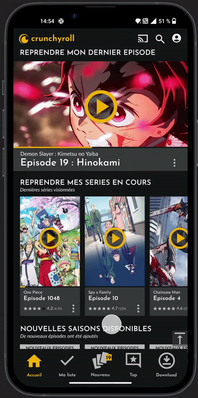
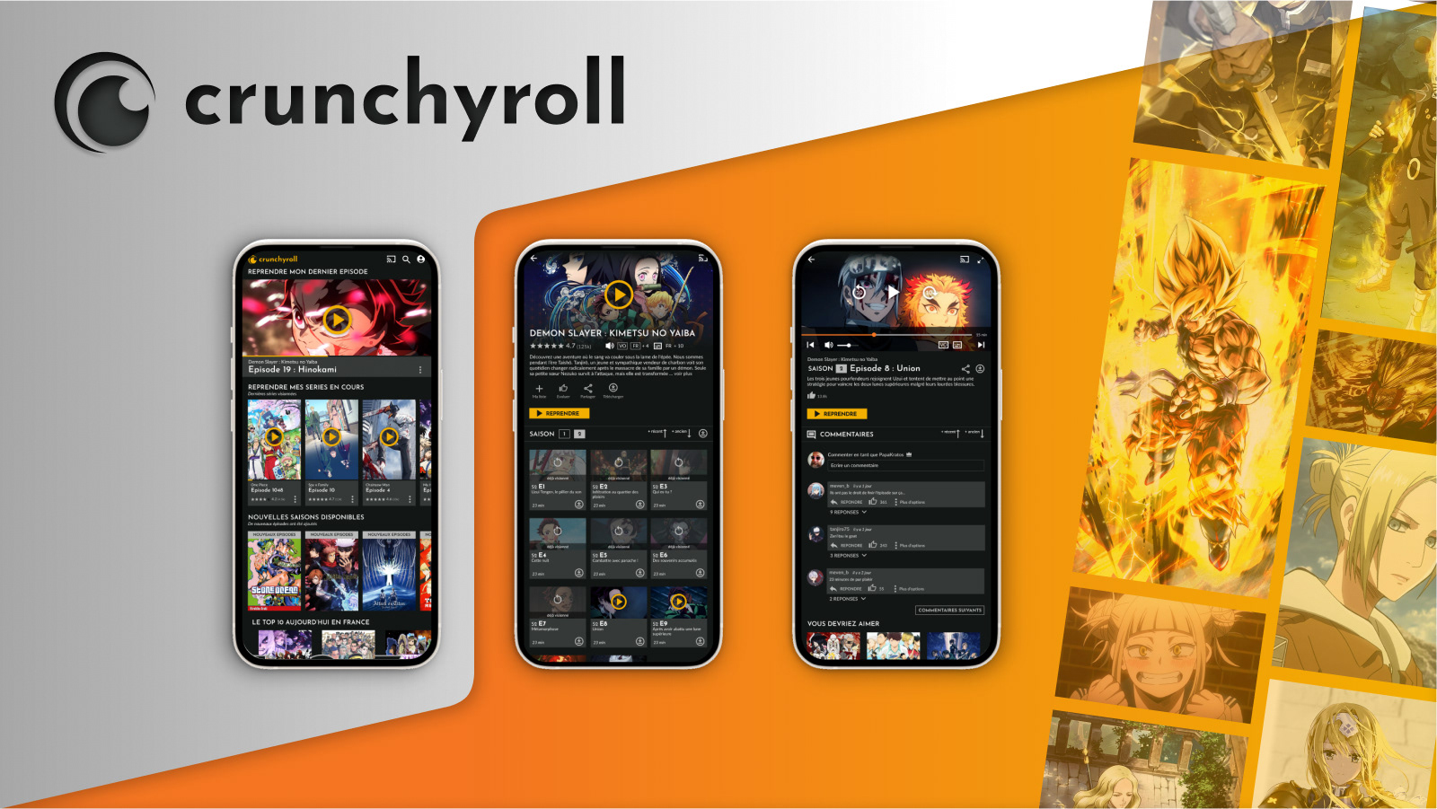
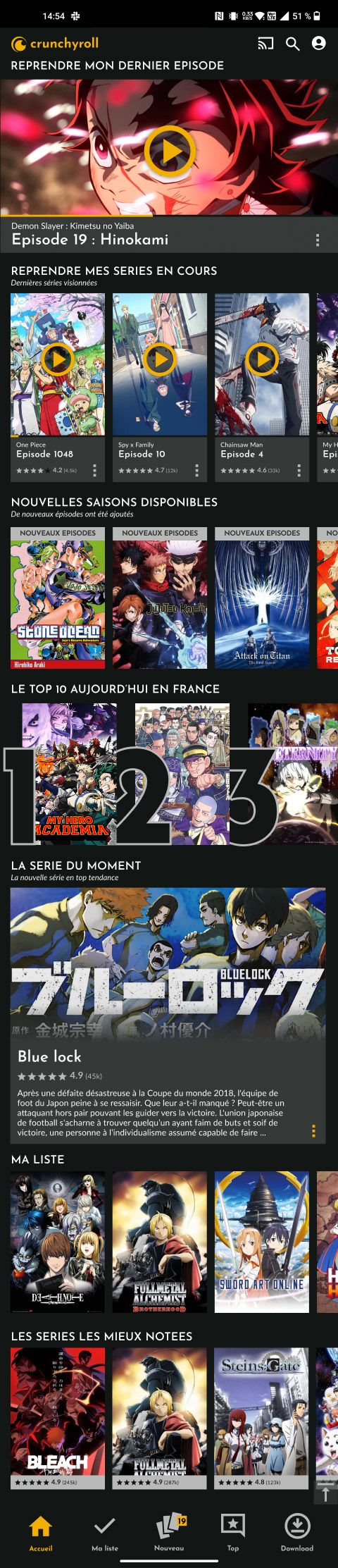
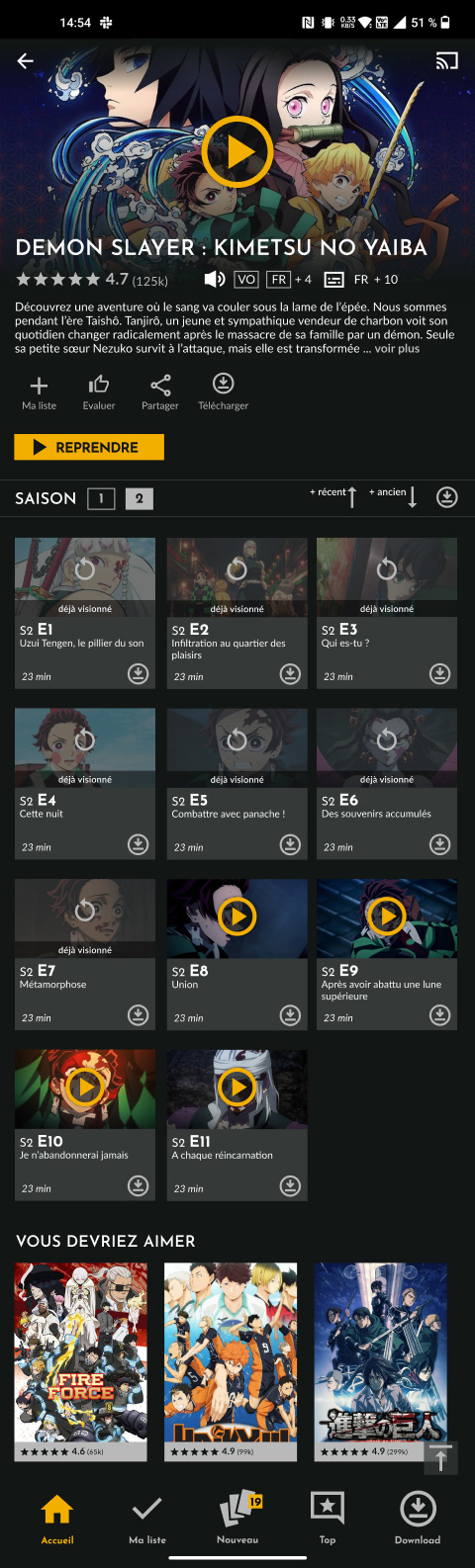
Two hi-fi wireframes of the 3 screens I chose to redesign to correct the main heuristic issues I observed during my initial research. I tried to maximize the use of space and thus avoid having large vertical voids ending without any CTA. I also chose to use the primary color only for calls to action (play or resume). I reviewed the cards and establish what I consider to be a more consistent card system.
A GIF video of my Figma interactive prototype.